

UI/UX
Interaction Design
Prototyping
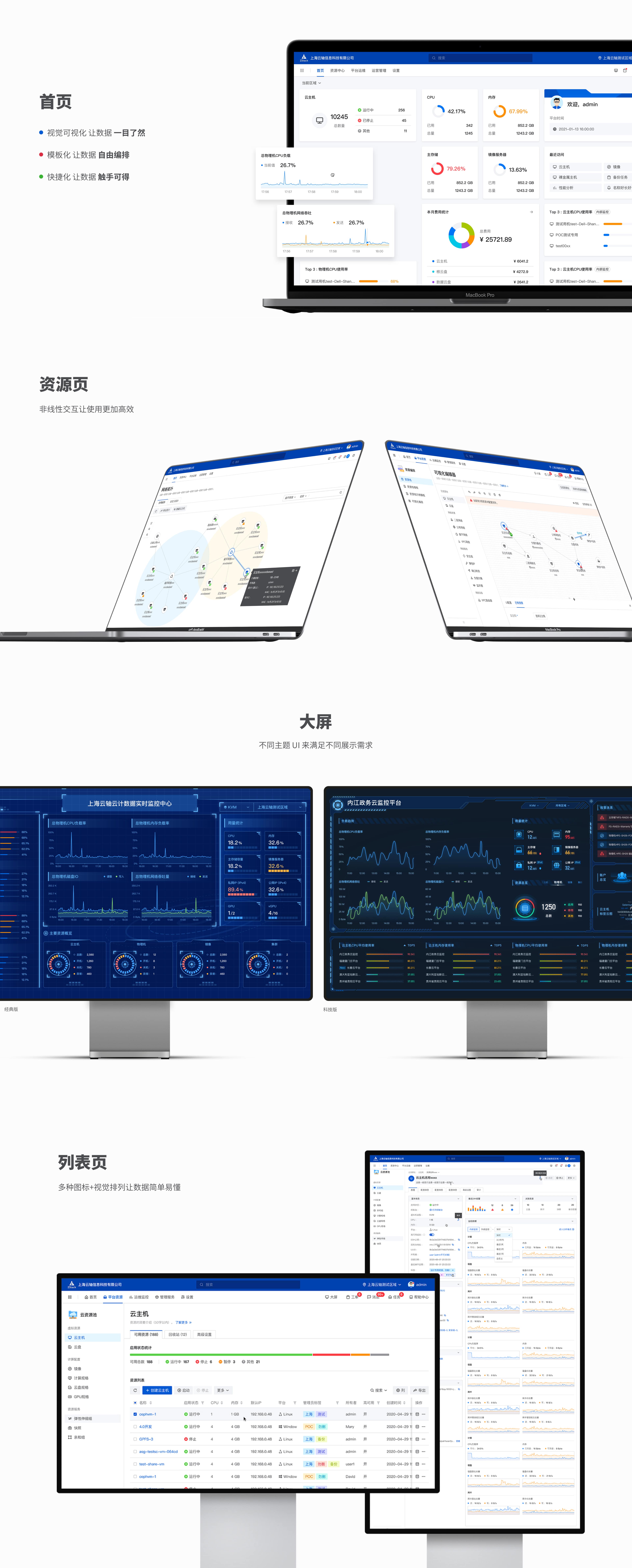
ZStack 4.0 (阿里云私有云敏捷版)全新UI 和 交互
包含整套产品设计流程 + 组件库 设计
2020 Sept - 2021 March

ZStack is an independent innovation and product-focused cloud computing company. With the mission of "lowering the threshold for enterprises to go to the cloud" and the vision of "making every enterprise own its own cloud", it provides self-developed ZStack private Cloud, ZStack hybrid cloud, ZStack Mini edge computing all-in-one machine, ZStack CMP multi-cloud management platform, ZStack Ceph Enterprise Edition and ZStack Xinchuang Cloud Platform and other products and solutions.
In 2017, it completed the A round of financing led by Alibaba Cloud, and in 2018, it completed the B round of financing led by Shenzhen Capital and Alibaba Cloud and other institutions. In 2020, 230 million yuan of B+ round of financing will be completed, led by Sanxia Xintai, China Internet Investment Fund, Bank of Communications International, Anheng Information, Langmafeng Venture Capital, Paradise Silicon Valley, Wenqin Capital and many well-known institutions follow the investment, and old shareholders Alibaba Cloud, Shenzhen Venture Capital, Xiaomiao Langcheng, Lianxin Capital, and Qianhai Fund of Funds continue to invest

ZStack 4.0 as my very first project of the profession, it has millions of market value and 120+ various features to satisfy 1200+ different clients(enterprises) purpose of using our powerful private cloud service, which means this product has a huge difficulty in both design and usage, simple and easy interactions with massive data visualization would play a very important role in our UI designs. Based on the well-known UI component design by Ant design, we also developed our components depends on our needs.
The reasons why we design our own UI component are essential, 120+ feature have their own usage environments, there is no existing component can satisfy our features, let alone the importance of having our own art direction and style with using our component. The native compnent library make our design much more easy, and make the front-end more effective, and also help our product have a strong and user-friendly interactions, make users easier to get started. My role here mostly builds our components, researching and comparing opponent’s designs, and try to improve the UX and fit our usage environment and design them based on our own design style and principles. By constructing the components, app design becoming very easy, we just need to assemble components together.

In my job as an Interaction design and UX designer, communication also becomes one of my tasks, every day I need to deal with the front-ender and QA tester to make sure the design can be done in a user-friendly way. The research of different UI component libraries and other opponent products like aliyun cloud and Huawei cloud also gives me important experience about how to make design implemented into the market and how to make interaction and UI more user-friendly, thanks to ZStack’s over 10 thousands of users.
Moreover, the experience in ZStack makes me more certain about my career vision, User experience is not only about UI, it should be problem-solving with users not only clients. In the future, I wish I can more associate with more complex problems and products using the UX method I have been taught at my University.